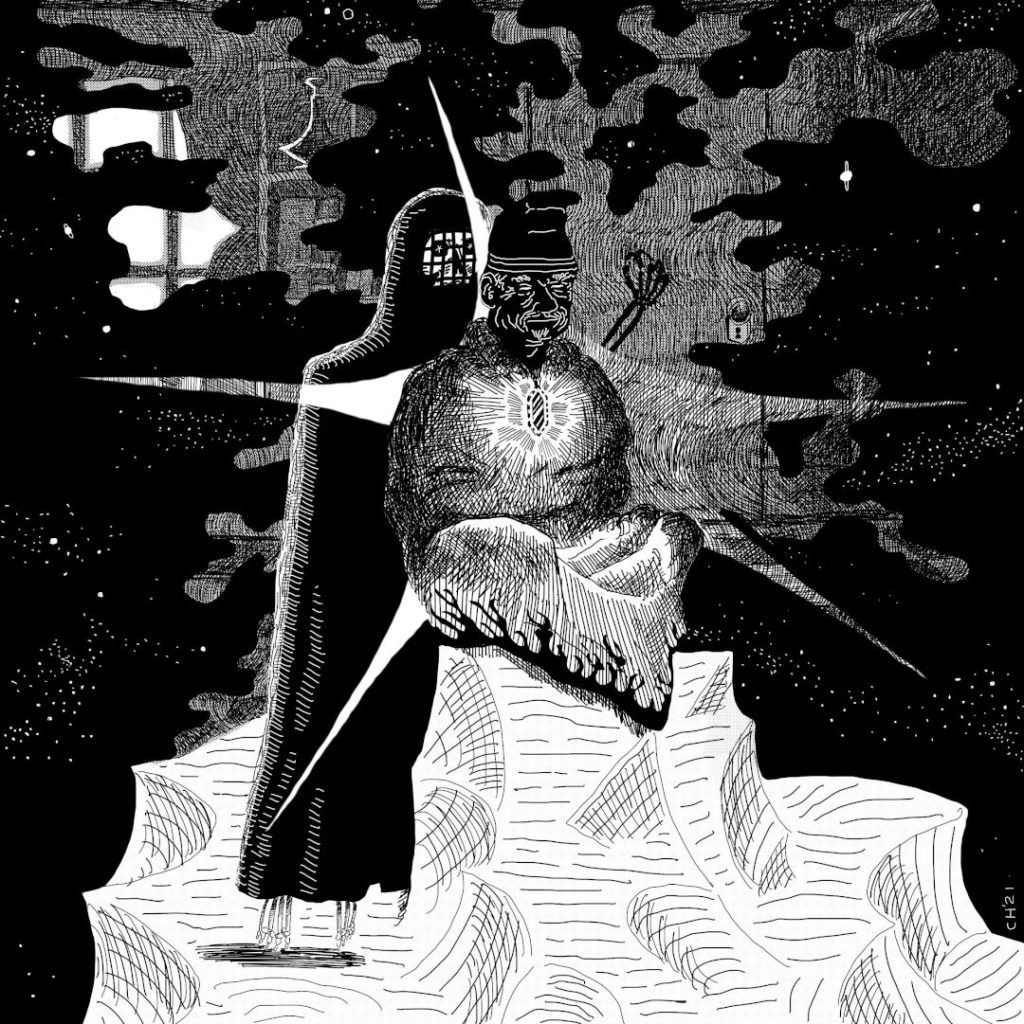
[Art] The Meeting (in the City-State of The Invincible Overlord)

These two depictions of nearly simultaneous moments stem from a campaign one summer in the City-State of The Invincible Overlord. Rules be damned, a floating skeleton and a robot agreed in all things took up an apartment on Wall Street, briefly explored the Wilderlands, then became exclusively preoccupied with improving their neighborhood, then starting an organization.
In the meantime, the skeleton Rharhangarth followed a posting for an apprenticeship under the Wizard Palletti on By-Water Road. Since the duo’s tactics at this time mostly revolved around the skeleton’s ability to give people false memories, the hand-shake between the wizard and skeleton triggered the spell, and to his surprise was repelled by an anti-mind-control amulet the wizard wore around his neck. “The meeting” somehow lasted two sessions as the dream-scenario got muddled and mired in logistics and magical precedence, and eventually the campaign got put on hiatus I as turned my attention to other rules that were less complicated. Now that I’ve ran a deathtrap dungeon and no longer have qualms sending characters to their grave should they make a fatal error- and likewise letting players trounce their problems if they’ve done it right- I’m much more excited to return to the strange and bizarre city (what is up with those lamp-posts???)

White-on-black is a real advantage digital drawing has over watercolor and ink. I broke up the space with a trapezoidal floor-shape silhouette shape, and started from there. I drew a few sketches, then filled out one where both faces were visible, so I could get a sense of personality. It didn’t depict any of the magic wielded by the skeleton, nor really convey the power of the amulet, so a couple of weeks later I filled out another sketch. An embroidered robe, Giotto-esque mountains, the specific gown of Rharhangarth, all accounted for. I had a good time using heavy blacks and using different techniques like the white-on-black effect selectively. Lastly, I find the “wood-cut” effect of the first picture quite interesting- the linking of black shapes, and lines flowing alongside each other.